Quantify Crypto’s Fresh New Look
John Barry | Fri Nov 07 2025
Quantify Crypto has officially launched a fresh upgrade to it modern design across its platform. The update delivers faster price updates with a cleaner interface, faster load times, and improved accessibility for all users, including those with color vision deficiencies.
A Smarter, More Accessible Interface
The redesign followed ADA (Americans with Disabilities Act) accessibility guidelines throughout development. Our front-end engineering team reviewed WCAG 2.2 standards and implemented adjustments to ensure compatibility with screen readers, keyboard navigation, and improved color contrast across all interactive elements.
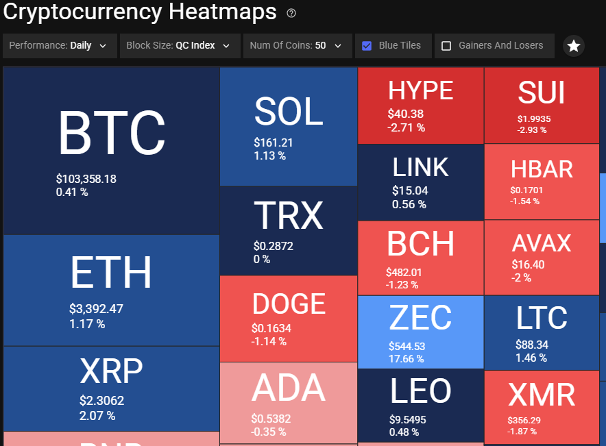
Since 2022, Quantify Crypto has supported Blue Tile Mode option for color-blind users, and this new update expands on that foundation. For users who are color blind or have contrast sensitivity, this Blue Tile mode replaces traditional red-green visuals with a blue-gradient scale — allowing everyone to interpret bullish and bearish market moves accurately. Accessibility isn’t an afterthought — it’s an ongoing priority.
As part of this initiative, we’ve incorporated additional accessibility review processes into our regular development cycle to ensure new features continue to meet ADA and WCAG standards.
And this commitment is personal: we have a few relatives who are color blind, and that perspective drives us to ensure our visual tools remain inclusive and usable by everyone.
Designed with Real Users in Mind
This redesign wasn’t just about aesthetics — it was about improving the real-world trading and research experience. From enhanced navigation to simplified chart controls, every change was guided by feedback from our global user base.
To learn more about the updates click on this link https://quantifycrypto.com/accessibility-ada-compliance